I AM HERE
FRAC NORMANDIE, CAEN, FRANCE
APRIL 6 — DECEMBER 12, 2024
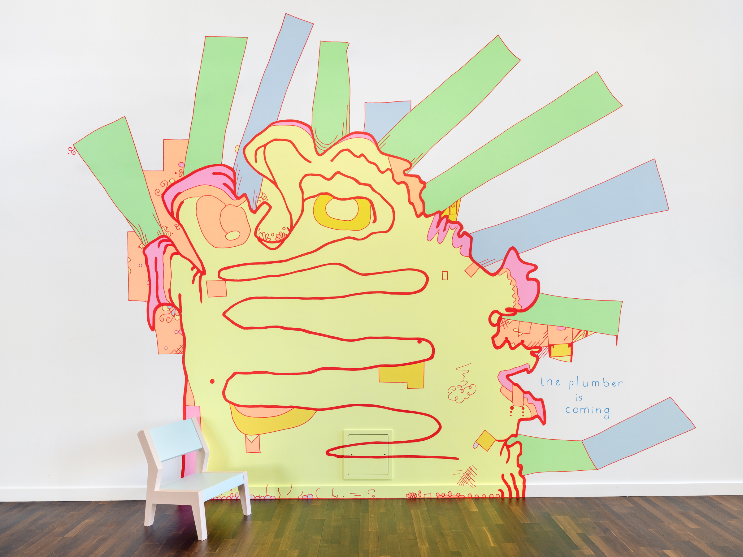
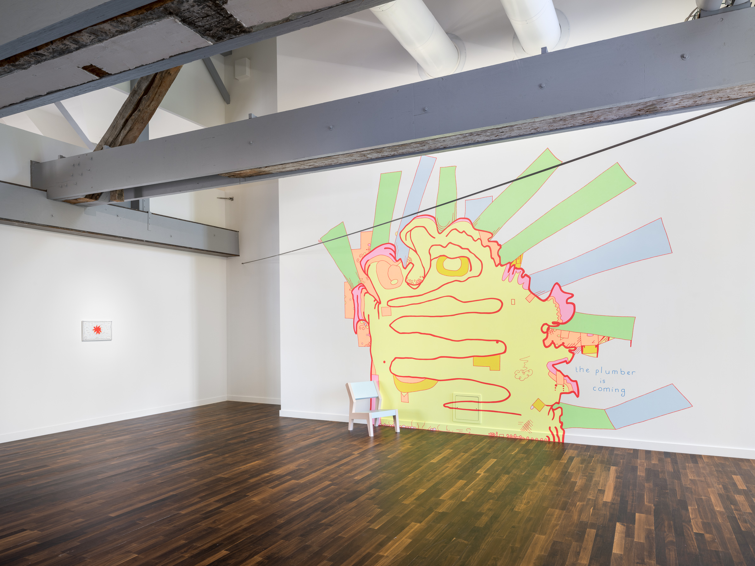
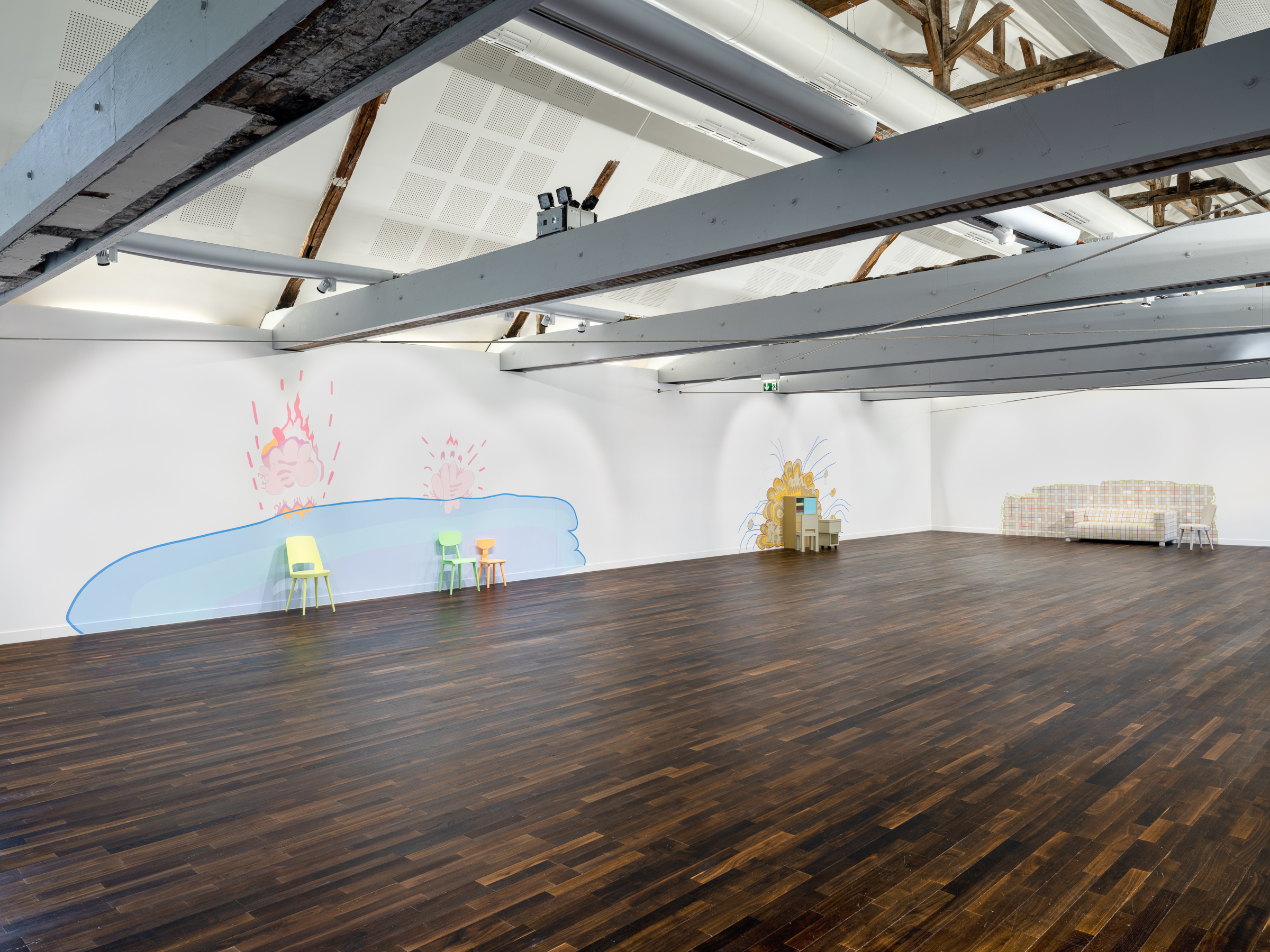
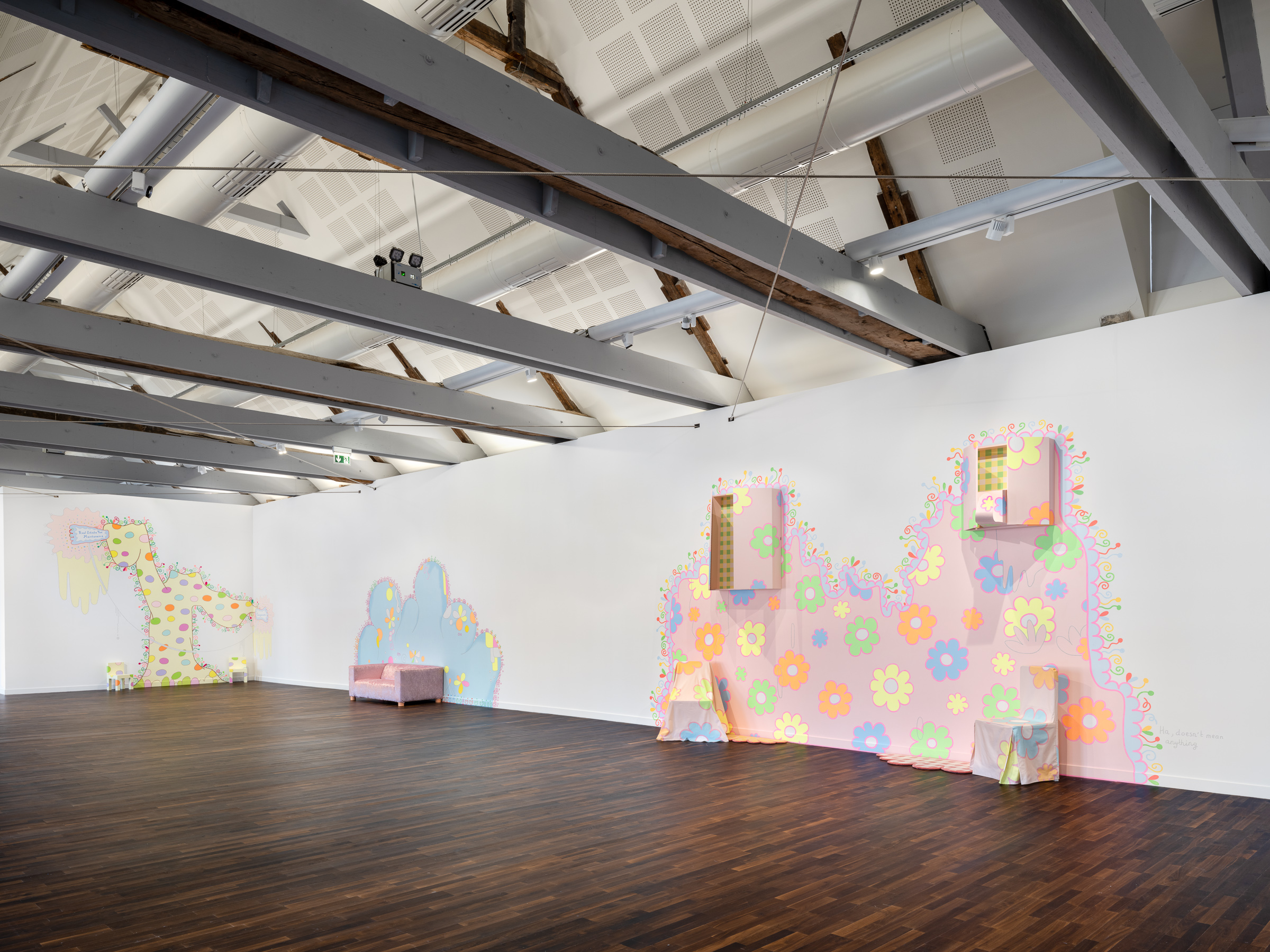
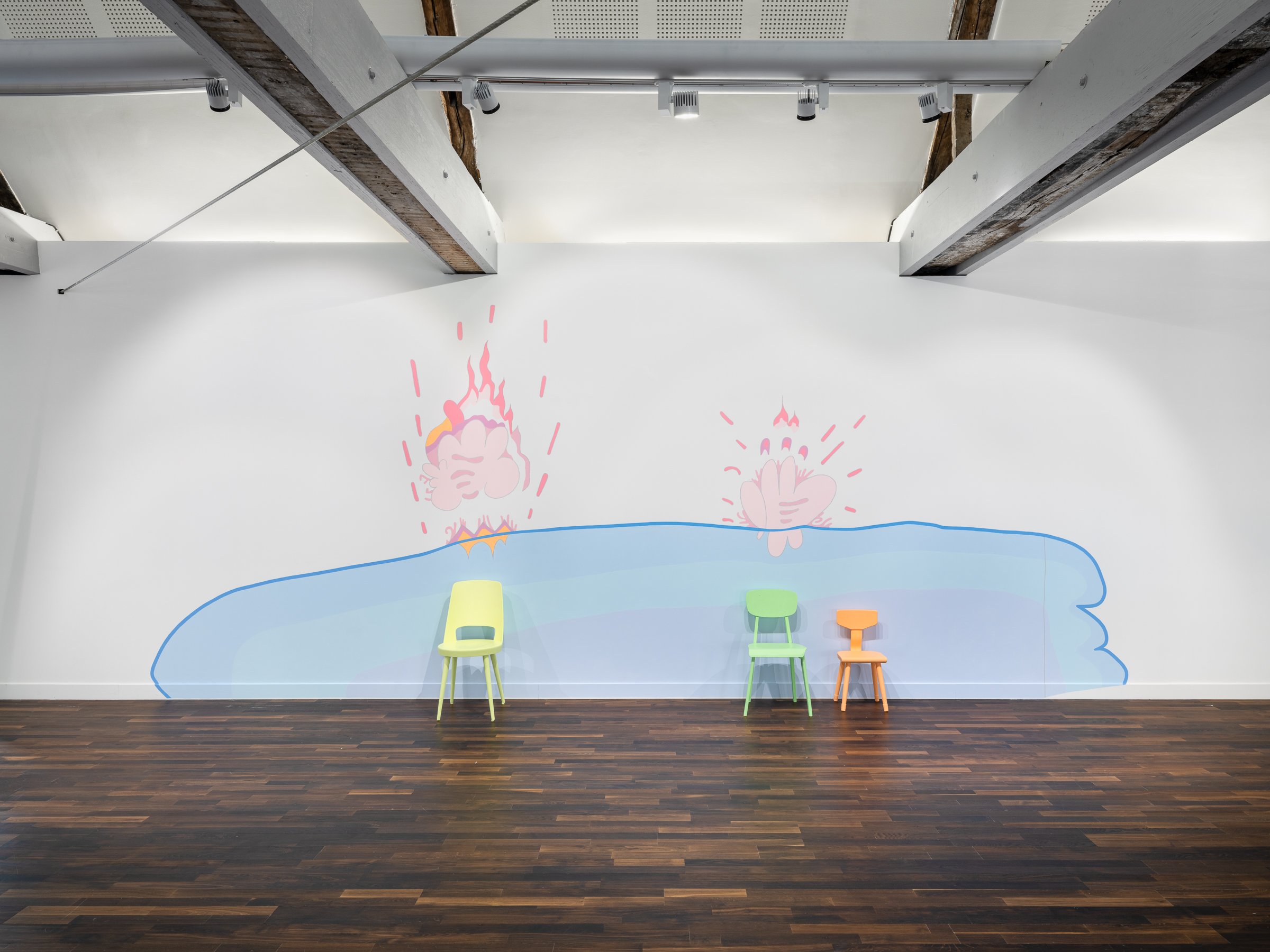
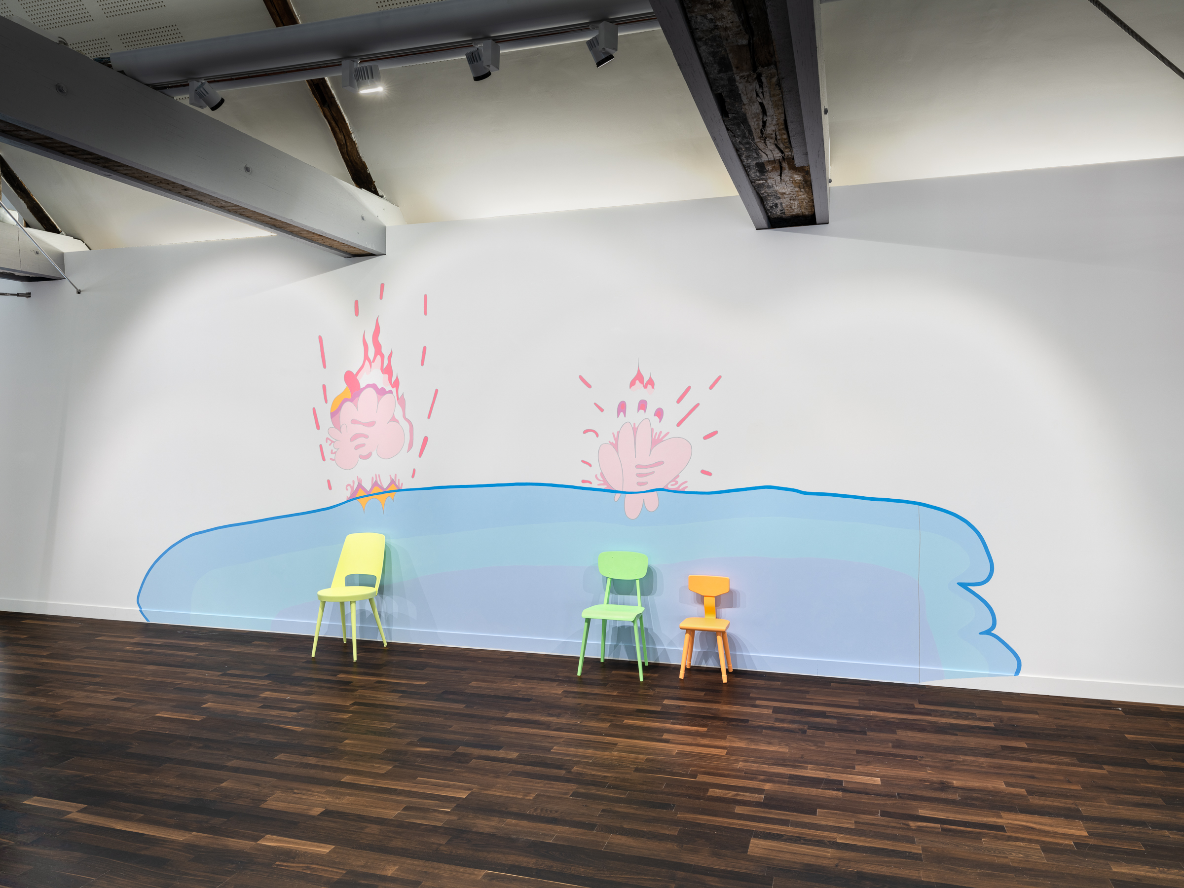
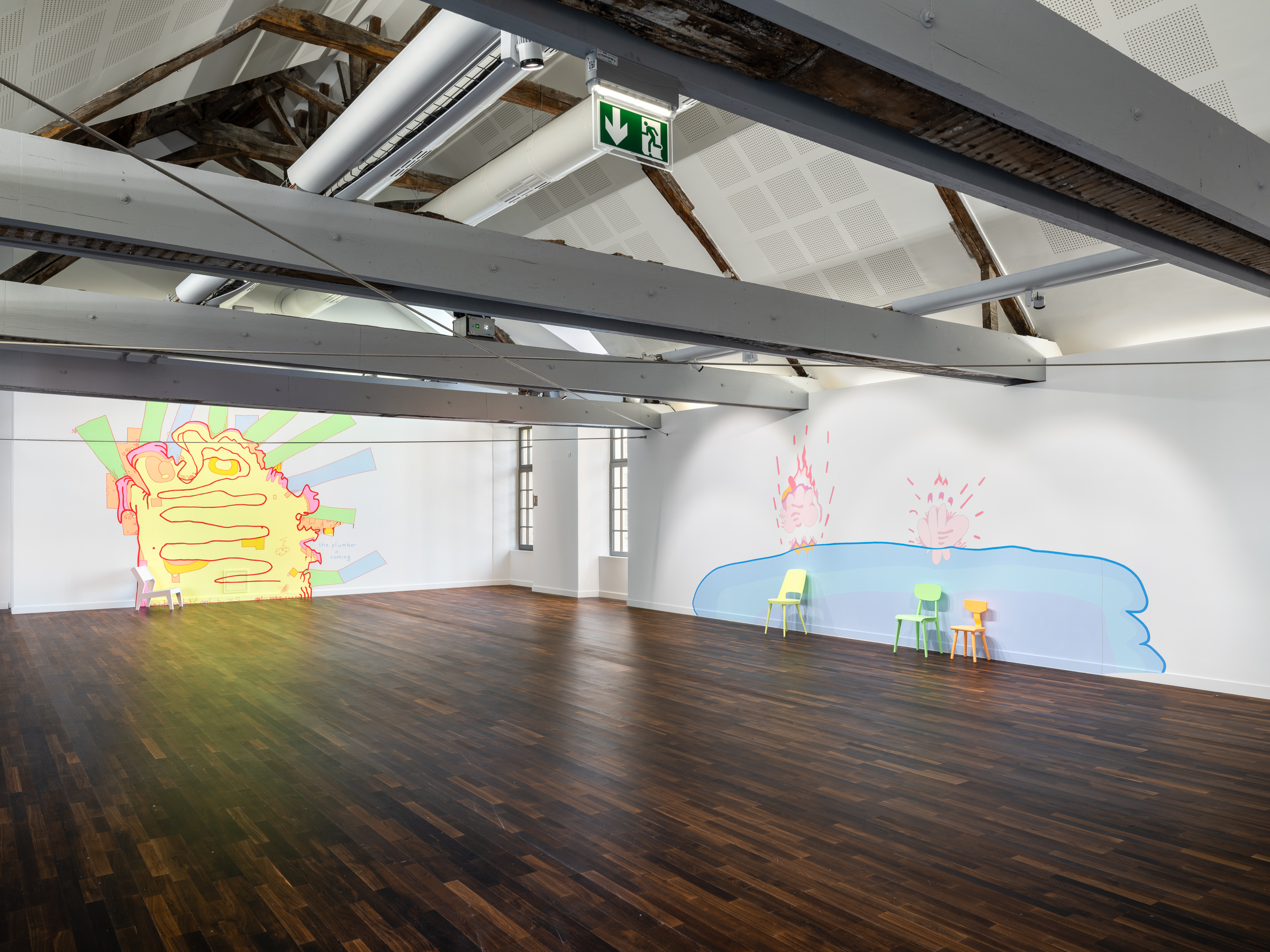
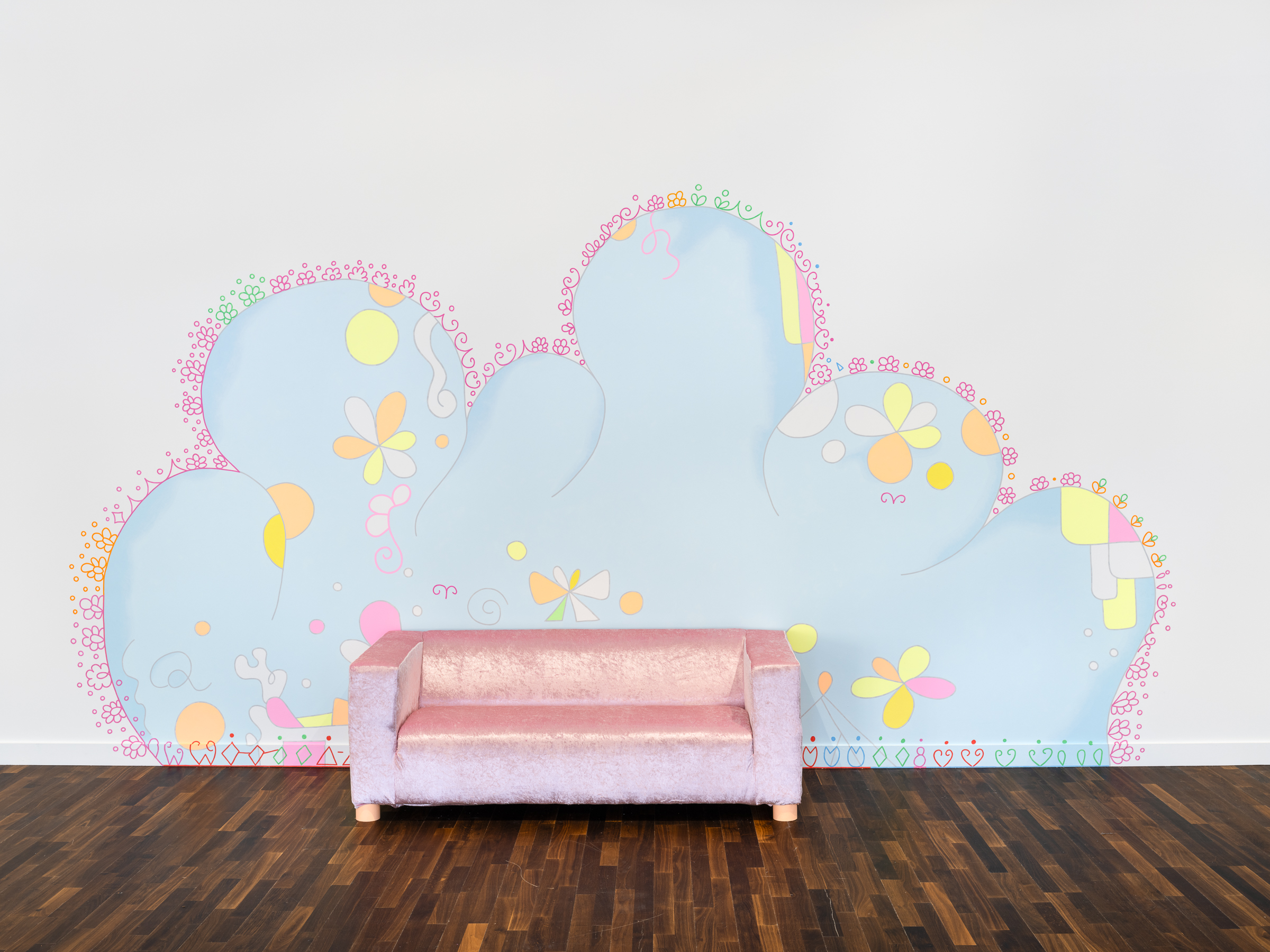
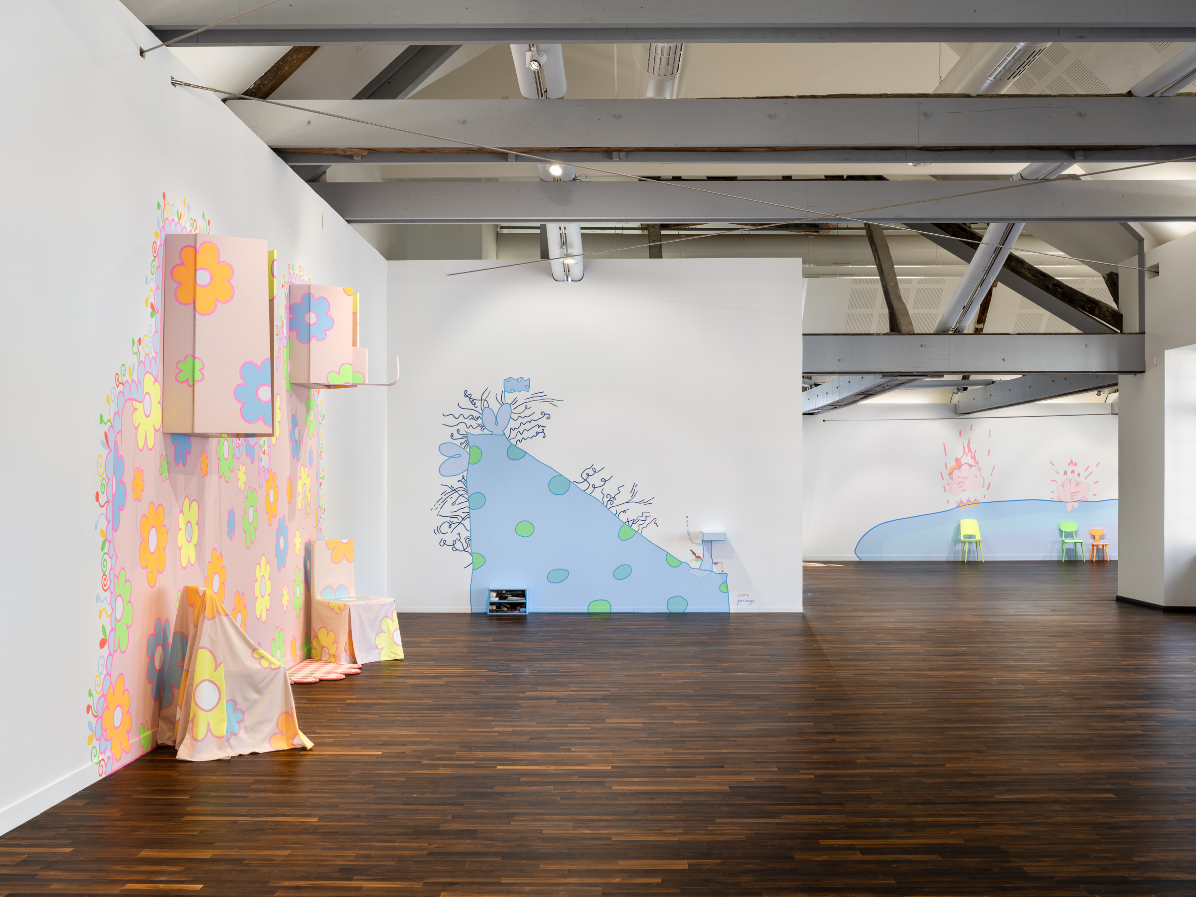
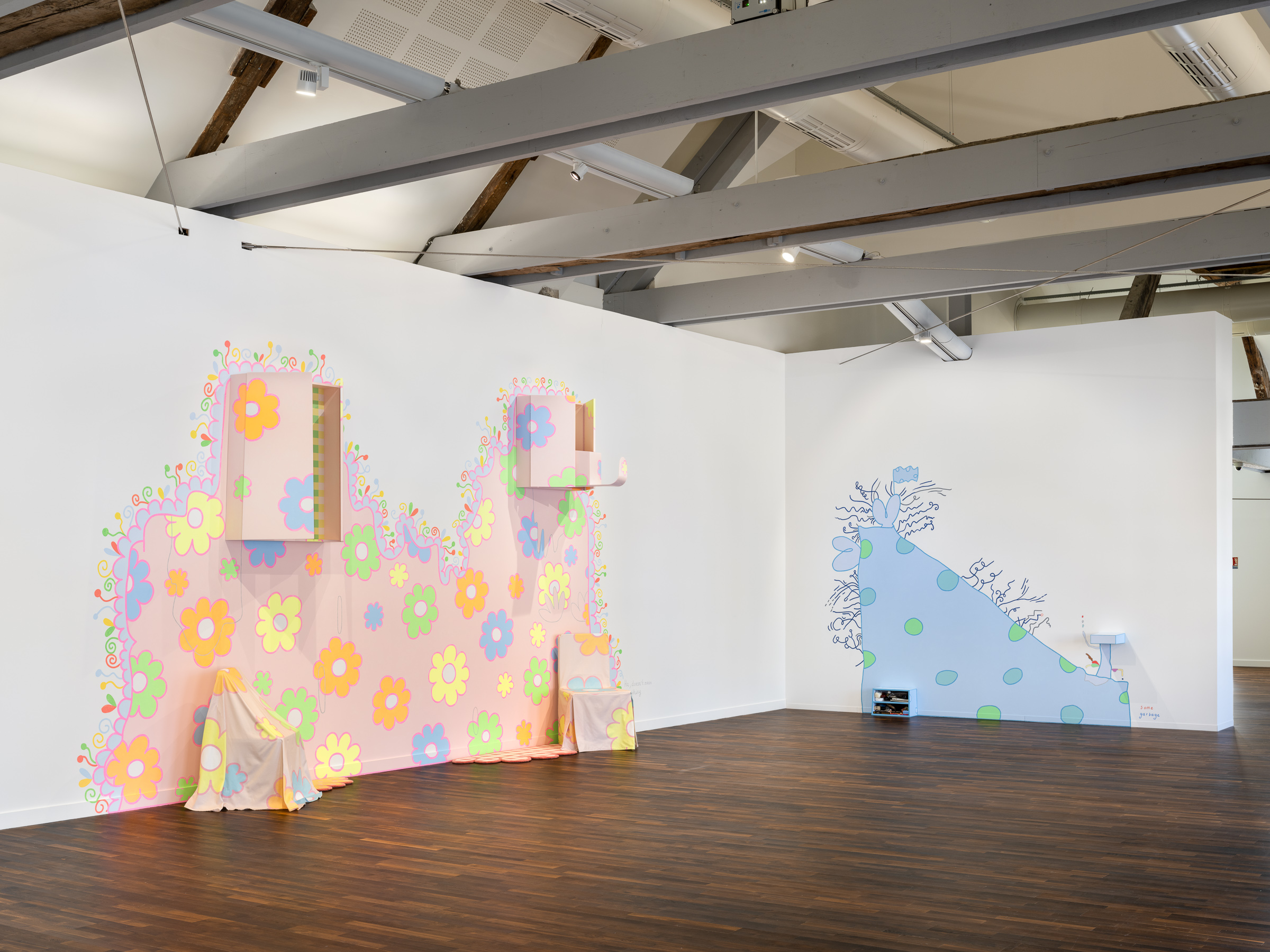
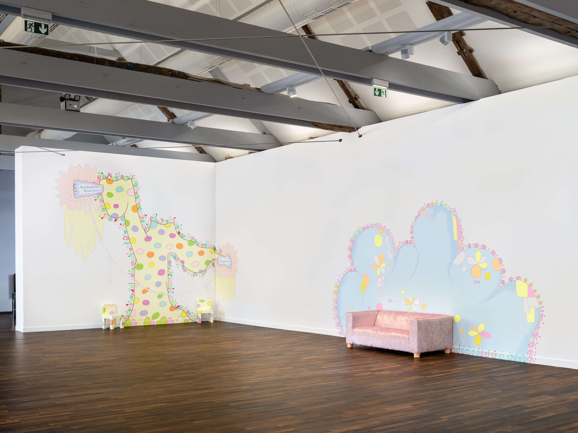
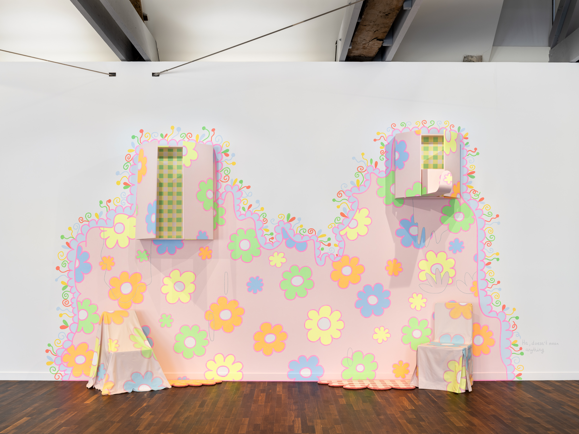
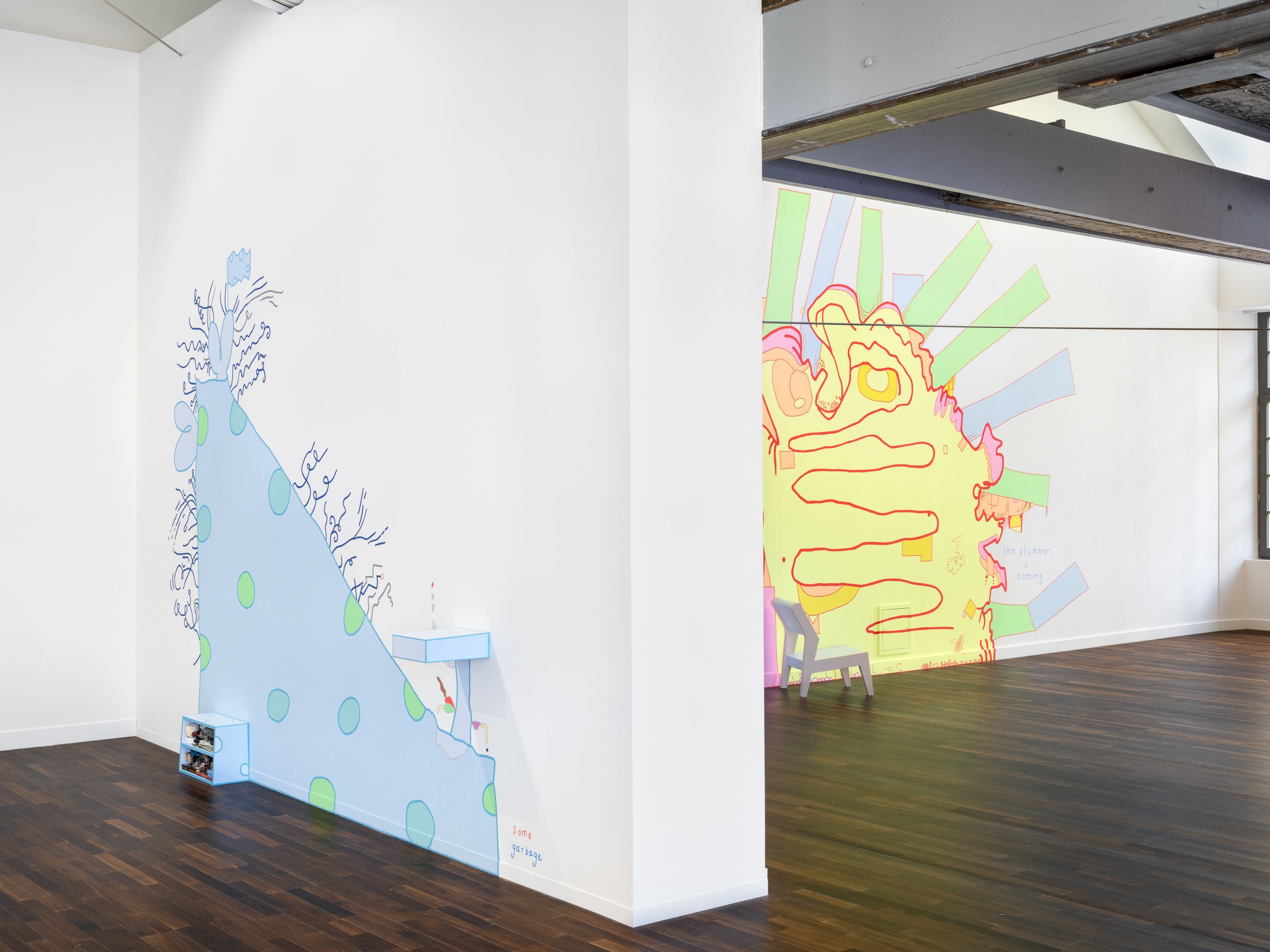
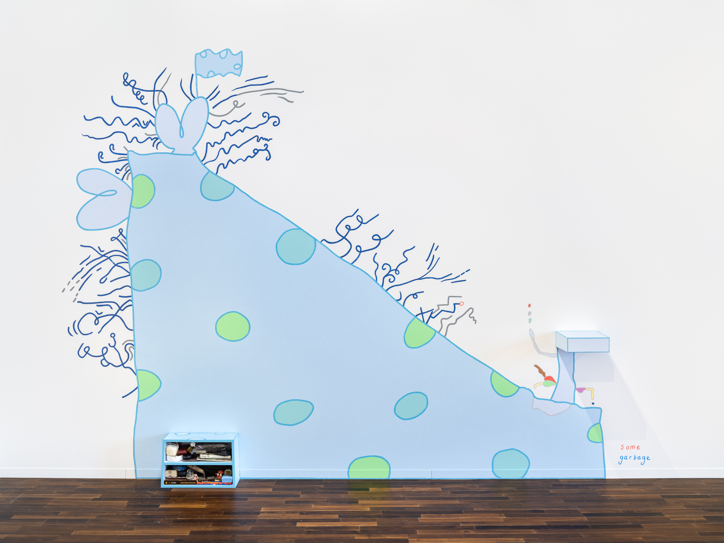
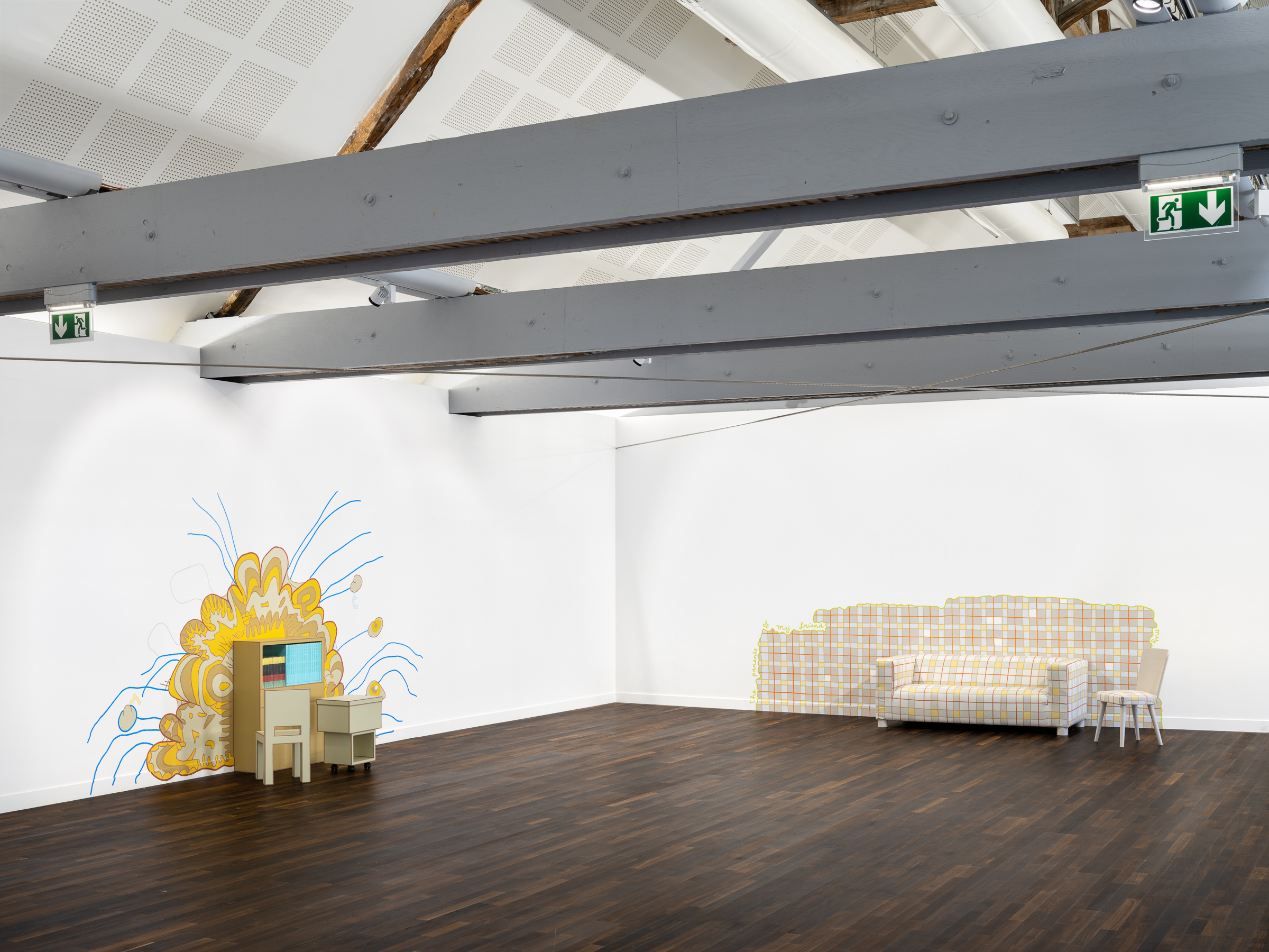
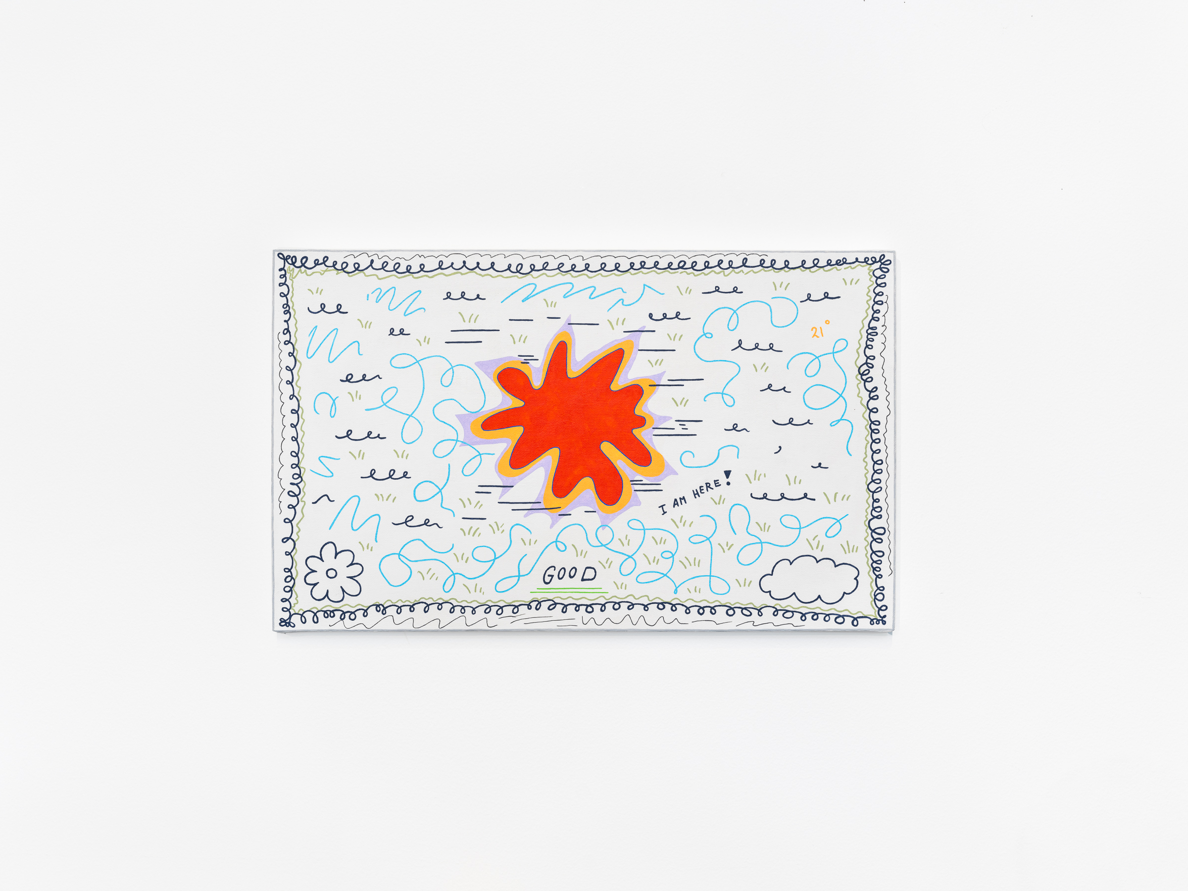
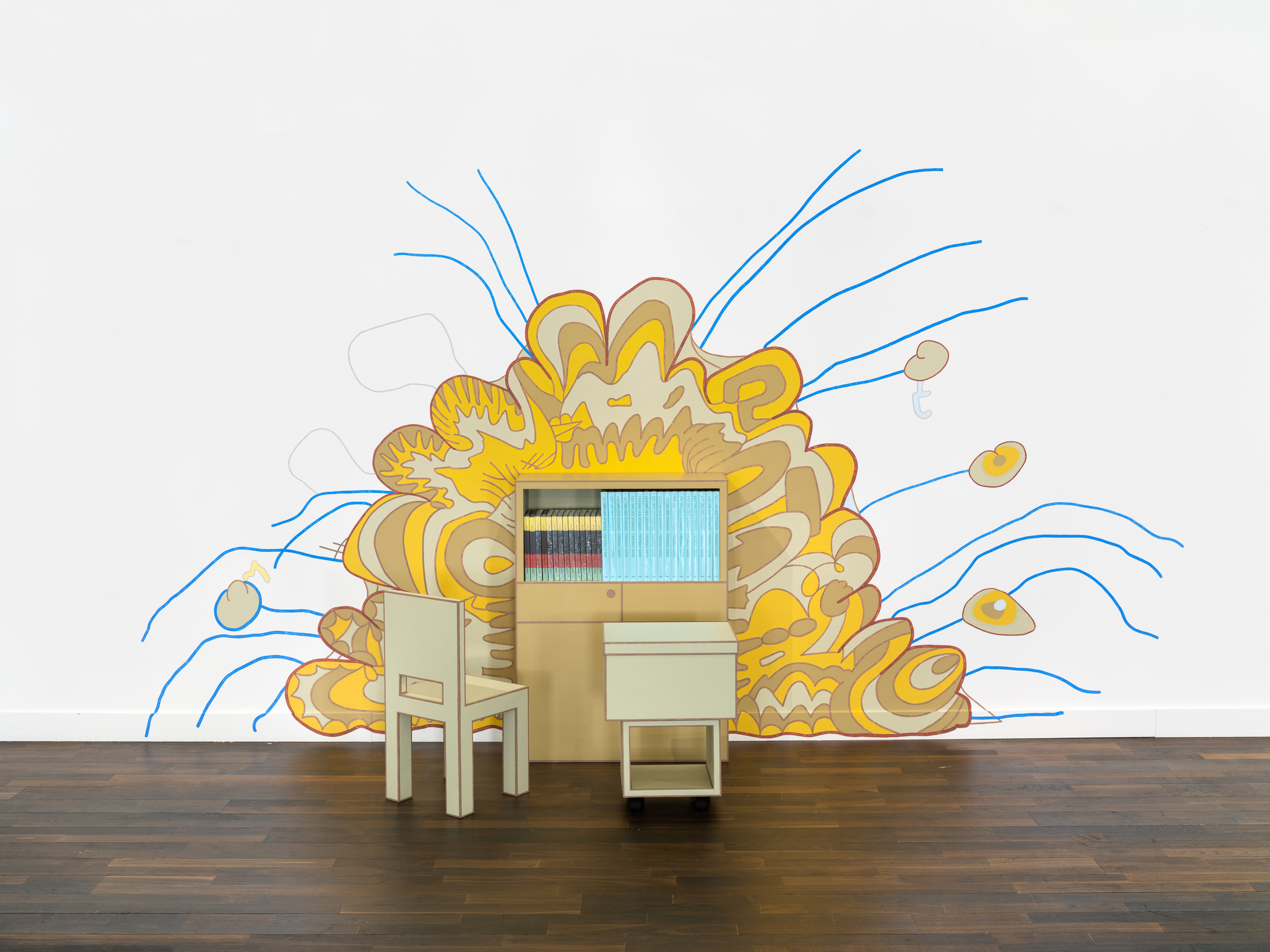
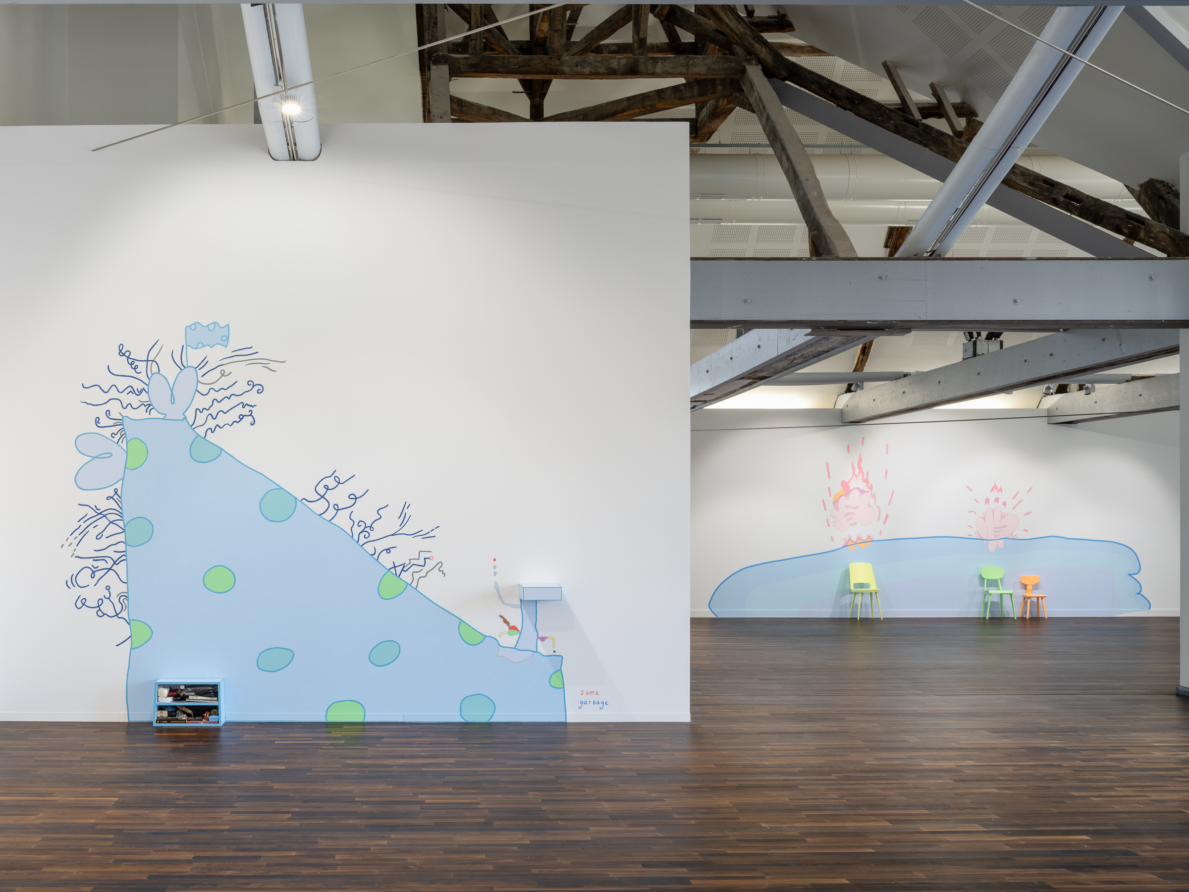
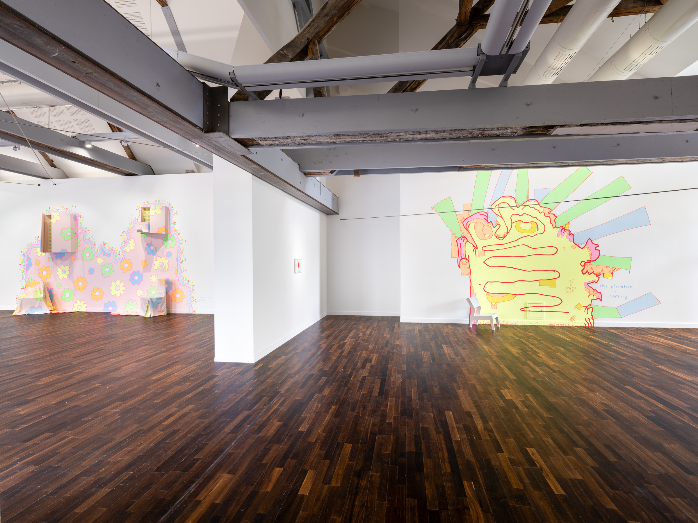
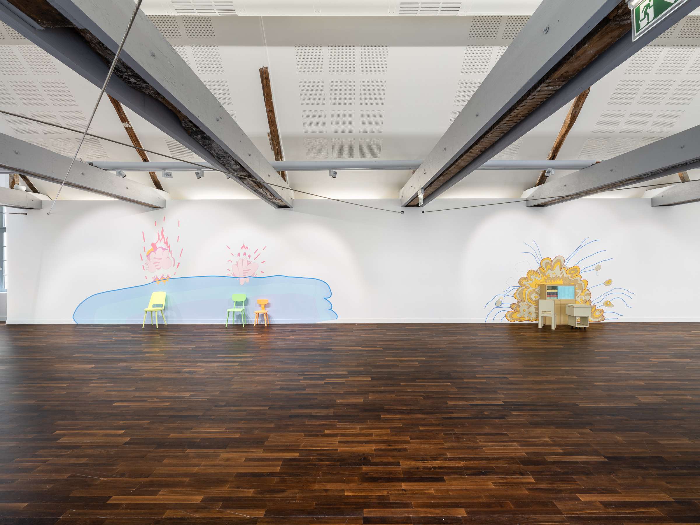
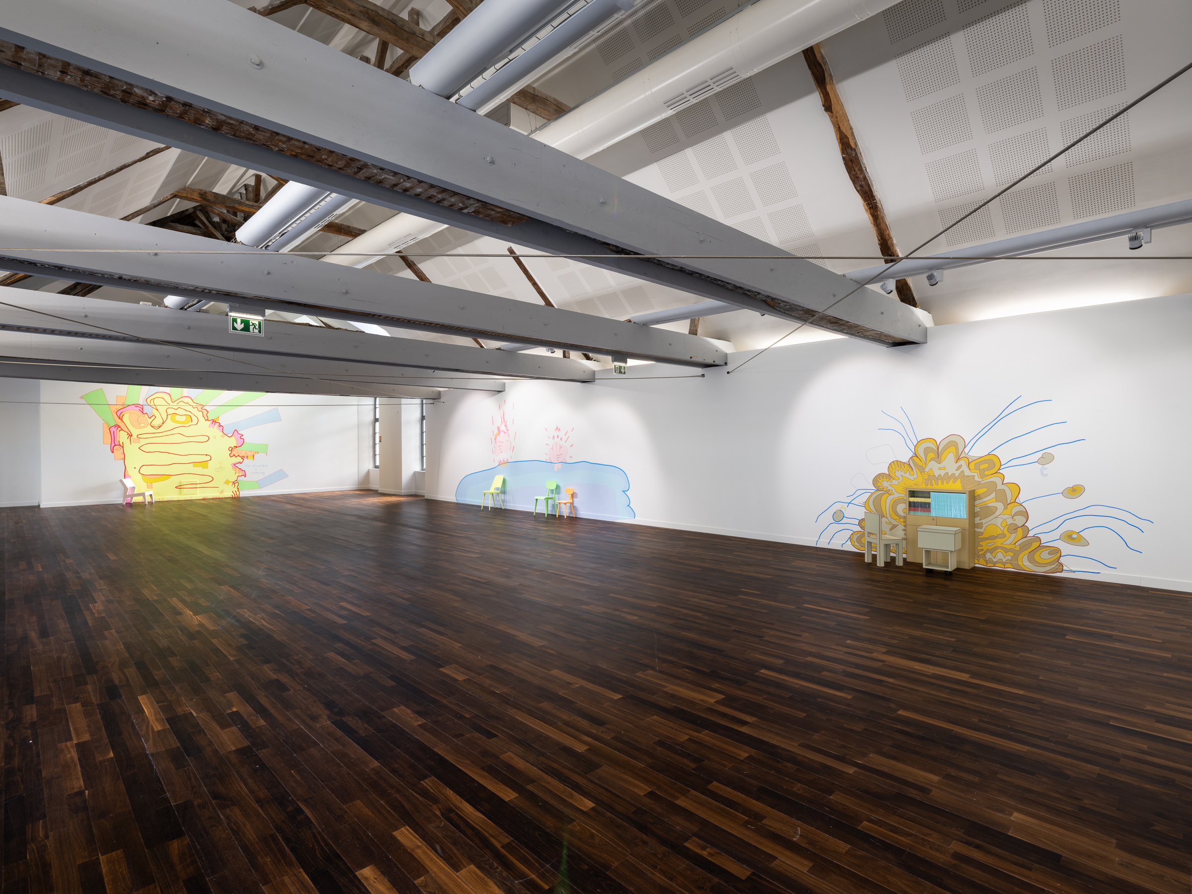
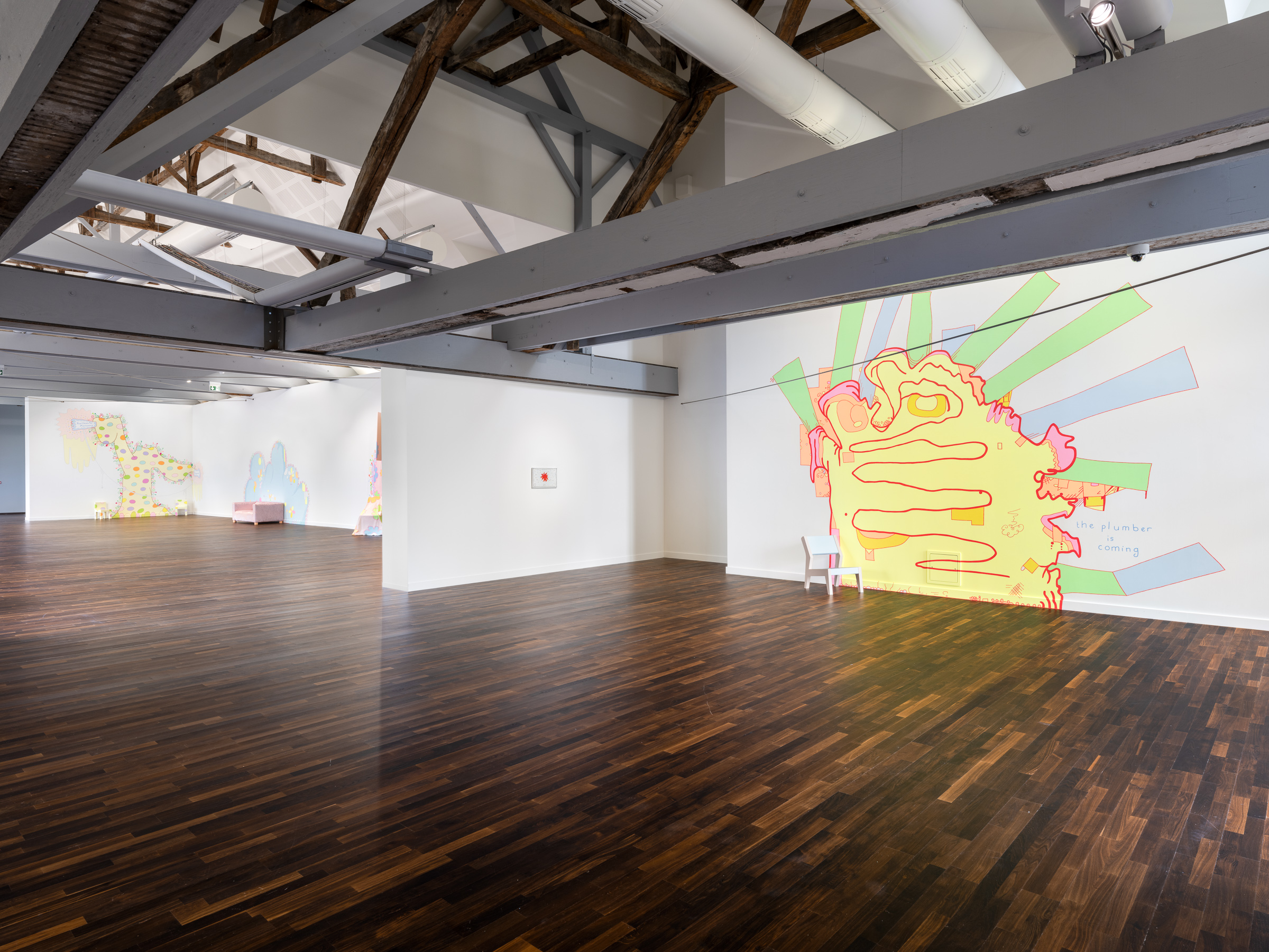
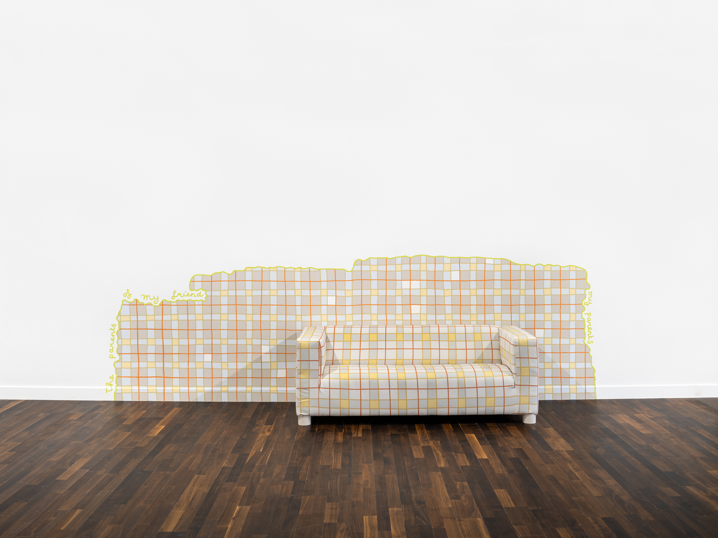
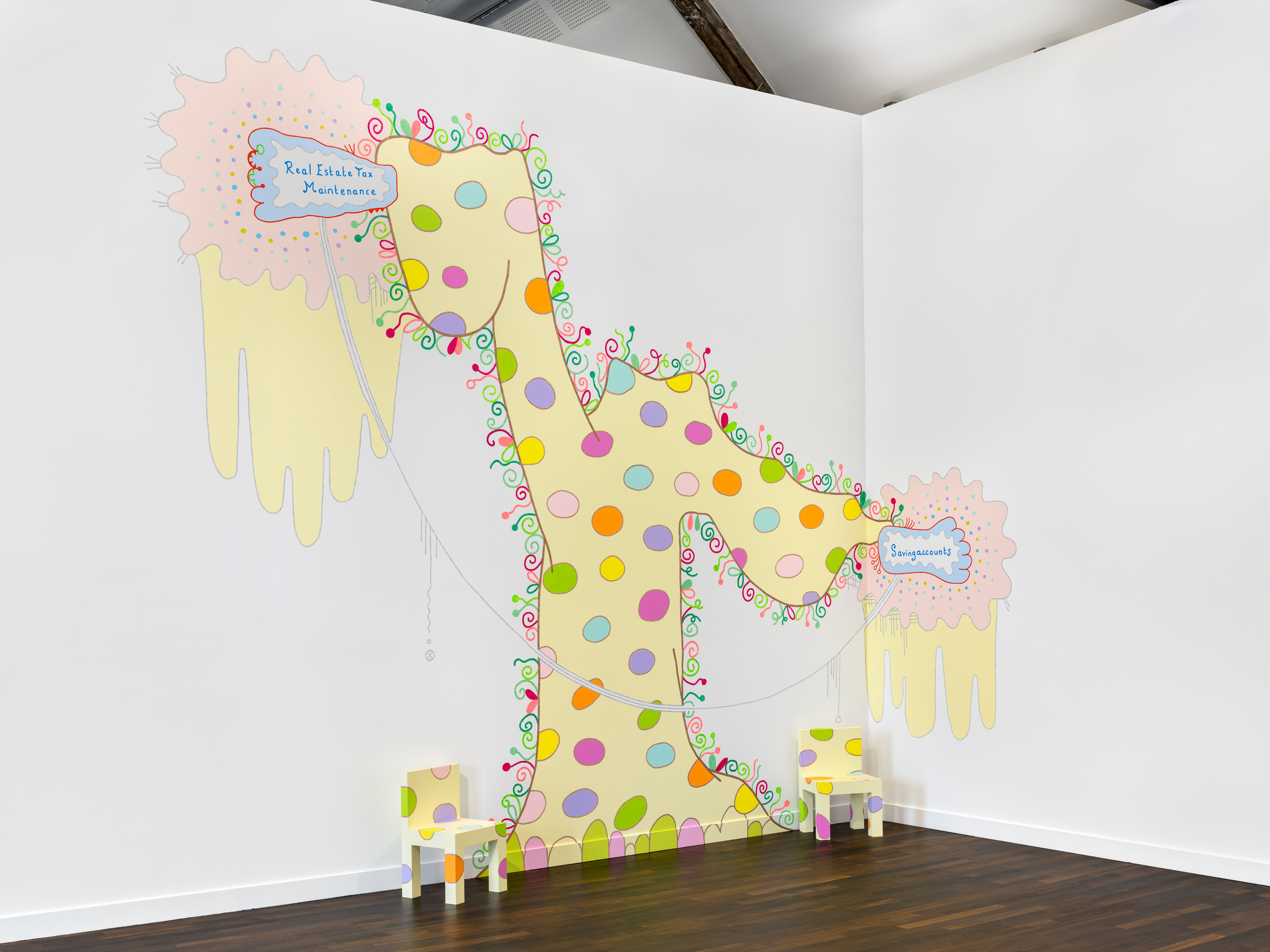
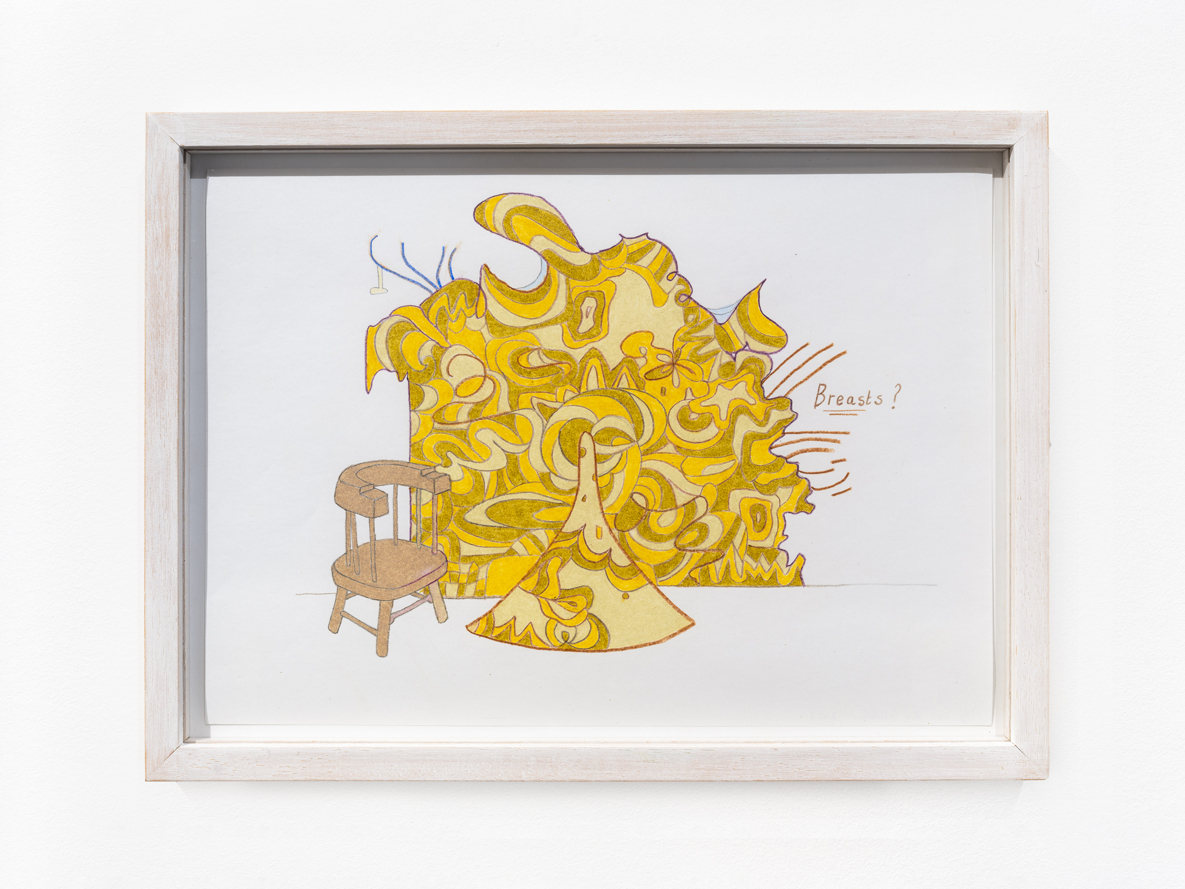
Lily van der Stokker has been known since the early 1990s for her playful, brightly-colored murals. Floral motifs and ornamental clouds are recurring motifs in her world, with an aesthetic and palette reminiscent of Pop Art. Meticulously executed in a slow, painstaking process, the murals are made from small-scale drawings that the artist prepares with precision. Comedy, satire and irony are the hallmarks of Lily van der Stokker’s work. Text fragments such as ‘Friendly Good’, ‘Yeah’ and ‘How’ are often addressed directly to the viewer. Her work questions the stereotype of femininity, ostensible banalities, the economy of art and the everyday existence of the artist.
Underneath her cheerful exterior, her work challenges stereotypes of femininity, and tackles subjects that are a priori opposed to these formal biases, such as the economics of artistic creation, the validity of public policies, or the ordinary constraints that weigh on an artist’s life.
In this exhibition, a series of large-scale murals and furniture highlight universal themes such as family, meaning and existence, as well as others that have traditionally been kept at arm’s length from the world of “serious” art, such as the decorative or plumbing problems. Lily van der Stokker looks for beauty in ordinary things, including ugly ones.
Joy, well-being and anything that might upset these states are among her favorite subjects. She describes her work as ‘Easy looking art that is difficult’. The apparent lack of seriousness of her art is in fact a militant stance, which goes far beyond irony.
In a discussion with the eccentric director John Waters, a great fan of her work, she defined herself as a “conceptual pop artist and feminist”. That she is a woman who asserts herself is obvious: by outrageously assuming in her art clichés generally associated with femininity (pink, little flowers, ornaments, decoration...), she exacerbates them to better assert a difference. That her works have a “Pop” dimension goes without saying. But what makes her a “conceptual” artist?
Formally, conceptual art adopted a kind of “office” aesthetic: typed texts, photocopies, archived newspaper articles, dictionary quotations, photos documenting actions or sociological reality... She, too, uses words extensively in her art, but the texts are written freehand (in the preparatory drawings, at least), in a childish manner. Rather than aiming for a seemingly scientific objectivity, they emphasize the personal, the intimate, while referring to the conditions of possibility of art, including gender prejudice, financial limitations, the need to integrate a network of friends into the artistic milieu.
|
|
|
|
|
|
|
|
|
|
|
|
|
|
|
|
|
|
|
|
|
|
|
|
|
|
|
|
|
|
|
|
|
|
|
|
|
|
|
© Martin Argyroglo